

Simple setup. The background is non-existent and the floor and stairs are very simplistic. They only serve to emphasize the family which is the point. Sometimes (most times) modern cereal commercials get so worked up over the highly detailed backgrounds and environments that they take away the emphasis from the cereal, which is stupid.
This commercial design is straight to the point. Where do we eat cereal? In our homes of course!

I also love the newspaper cutout. It's clever and reads easily on TV. It looks like most of these old commercials were made for those small screen TVs everyone had back then. But just because we have more screen real estate today doesn't mean we have to fill it up with details that get in the way of the message. I would look at it more as an opportunity to make bigger, bolder, more easily read statements. Apple product commercials already know this.

Even though the style is very simple and geometric, the characters all look very organic and alive.
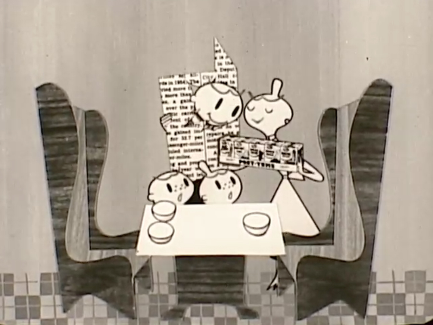
Look at their faces! It's so appealing! Look at the dad! This is the "Have a nice day" smiley face decades before it was invented.

The family is all at the table around Post Tens. No frills. This is pure advertising.


I like the cartoons better than some strange man telling me what to do.

View the commercial here.
No comments:
Post a Comment