Friday, September 23, 2011

The Lion King

*Spoilers ahead*
 I went out and saw the recent re release of The Lion King in glorious 2D (the first time since I was very small and it was on VHS) and I wanted to impart a few thoughts:


The first opening shots are probably the best in the movie, in particular the shot of the gazelle jumping through the mist onto a puddle of water. It's an immediate reminder of the beauty traditional animation can present. It quickly brought the audience of kids to attention and sucked them in.

The first half hour of the movie was the best part. That's when it felt most adventurous and took itself seriously. But after Simba left his pride and met up with Timon and Pumba, the movie became a little more self-aware (breaking the fourth wall), a little more cheesy, and a bit more light-hearted, much to its detriment. I didn't feel like it had the same amount of weight that the first act had, mostly because of Timon and Pumba. I'm not saying Simba should have had some deep existential crisis for all of the second act, but they could have toned down the kiddiness of it. There was a real sense that the dialogue was beginning to pander to a younger audience and was dumbed down. A lot of the jokes weren't as funny as I remembered them.

A few songs sounded pretty dated (I was cringing when the love song for Nala and Simba came on). But the more musical, choir stuff was still effective. I had a problem with some of the voice acting though. Simba had nice voice actor for when he was a cub, but when he becomes an adult, his voice sounds like a typical, generic Disney lead. There was no individuality to it and it's immediately forgettable, unlike his father's awesome baritone. I also didn't like Timon's voice. It was so grating and out of place.

This
Not this
I still think killing Mufasa was a ballsy move and added much needed weight to the film. Andreas Deja, who did a lot of the animation for Scar, did a really good job as well. Some of the animation for Nala was pretty good too, like the scene where her mom is giving her a bath.

Good, solid animation.
One of my favorite shots
 

I just wish the film was more Miyazaki than Hollywood. I don't think it needed the musical numbers or the one-liners or a second act with two annoying side-kicks making fart jokes. When the opening title comes on screen, it implies an epic adventure. Toning it down in the second act really undermined what I felt it was originally going for and, in turn, undermined the intensity of the third act (having Timon and Pumba help Simba fight off hyenas definitely didn't help). 

What is this doing in the epic final action piece?

But that said, it's still a joy to watch traditional animation on the screen. I still feel like there's more of a sense of honesty in the eyes when they're drawn than with CG. Hopefully with the complete domination of the box office this re release has had, Disney will take a cue and put on track more hand-drawn features. With today's technology, they should be easier and cheaper to make then ever. The audience doesn't care if it's drawn or CG as long as it's appealing and has a good story (more so appealing. Audiences can shell out for some pretty badly told stories. But if it's ugly? Well, just look at Mars Needs Moms). With the cheaper price, Disney should be OK letting directors have more personal visions and take greater risks. Not every animated film has to be the biggest thing ever. Can't we have some smaller stories and settings? Where's the US version of Kiki's Delivery Service or Totoro?

Ugly as hell. No one went to see this movie.

Anyways, so yeah, The Lion King is a bit overrated, but if its box office is any indicator, traditional feature animation isn't completely dead to US audiences (whew!).

Sunday, September 18, 2011

Sunday, August 28, 2011

Frazetta

As has been stated many times before, Frank Frazetta is a GOD. The book of his rough sketches, appropriately titled Rough Work, is like liquid gold to me. Just like the old renaissance masters, the rough sketches of a pro are almost more interesting to me than the finished works. I like seeing the different approaches to figuring out an idea at its conception.

One sketch (out of many) caught my eye as a good example of solid drawing principles:


 Pure, solid drawing.

 All lines lead to the head which leads down the arm, then to the arrow point, or the arrow can lead to the head. I think they're both important.

But the overall lines of action are clear.

 In silhouette it's still easily readable as an Indian shooting an arrow, muscles flexing and everything.

I think it's also worth mentioning just how organic all of his stuff is. With the proliferation of anime there seems to be a tendency these days to straighten things out and sharpen corners on the human body (to streamline it):

Anime is a style, Frazetta is nature. 


Monday, August 1, 2011

Jim

Here are some drummer boy sketches to help me get an idea for a character I'll call Jim, after Treasure Island.


Sketches

Here are two sketches I made in Escondido the other day:


Monday, July 18, 2011

Coconut Short Update

Getting through the line-work now. I started out not wanting a great variance in line thickness as I thought it would give the animation more continuity (I've had Flash line-variance-agony before) but as I got through some animation with a really thin line, I found that every little bump and blood pulse in my hand shows through. Adding color helps hide it but I decided a slightly thicker line would be less of a headache.
Speaking of headache, looks like Sen here is in the process of getting a headache as well (or a very serious concussion).

So I'm nearing the end of line work now. One thing I'd do differently next time is, and I've only realized I skipped a step now after some agony, that I'd do the rough animation, then do a cleaned up version, then do the line-work. It's frustrating making up some things on the spot with the final lines over the particularly rough drawings. Things like hair and body mass become inconsistent.

And another thing; I seem to be more accurate when Sen is exaggerated than when he's perfectly on model. It still feels like night and day drawing on the Bamboo tablet compared to drawing on a piece of paper though.

Wednesday, July 6, 2011

Still

Here's a still from my upcoming short. It'll be way better than the last one. Plus, this time around I'm using TVPaint which has much better sketching capabilities than Flash. And I find the timeline easier to use. But we'll see how easy it is when it comes to inking and coloring, which will come later.

Tuesday, June 14, 2011

Background Process

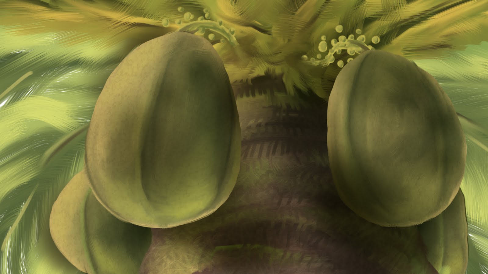
I'm making a new short for my portfolio starring the same Samoan character as my last one, Sen Popo. Here's my process in making the background for a shot (which is all done in Photoshop CS5):

For this upshot of a coconut tree, I decided to start with the coconuts as they are the main focus of the shot. First I lay down the basic colors. 

Then, using the mixer brush, I smoosh it all together.

Add a little reflected light from below.

Add the rest of the coconuts.

Block in the basic color of the tree itself.

Then add the other colors that make up the tree.

Smoosh it all together.

Add in some leafs in the background, some more detail in the tree, and the basic colors of the stems.

Smoosh the stem colors.

Here's where the thing really starts to come together in Photoshop. It's all about the textures one either finds online or takes with a camera.
Lay the desired texture over the coconuts (in this case an egg shell texture) and set the blend mode to a desired setting (in this case, overlay). Add a new layer with gradients (also set to overlay) above the coconut layer to add more shadow.

I overlayed a picture of fire over the leaves above and some organic textures for the trunk.

I put the fire texture over the background leaves. Then I added some blur to the leaves in the background and on the bottom of the trunk. Then I overlayed a paper texture while also adding a warming filter. That's it. Good enough for a quick shot.

Also be sure to make lots of layers for things. For my situation, I'm going to have the left coconut move slightly so I made it a separate layer. Separate layers also makes painting separate things and overlaying textures to specific objects easier.

Wednesday, June 8, 2011

Bad Staging, Bad Composition

This publicity still for Transformers: Dark of the Moon is terrible because it has bad staging. The complexity of the character makes it hard enough to see it but put an equally complex mass of gyrating, transforming crap behind it and that makes for an indistinguishable mess that is hard to read. There is no clear silhouette, no clear line of action, no pleasing arrangement of shapes. It's all just computer graphics puked out onto the screen in a haphazard fashion with no design sense.

How am I supposed to be in awe or say how cool it is when I can't even tell what it is? This is pathetic marketing.