I'm making a new short for my portfolio starring the same Samoan character as my last one, Sen Popo. Here's my process in making the background for a shot (which is all done in Photoshop CS5):
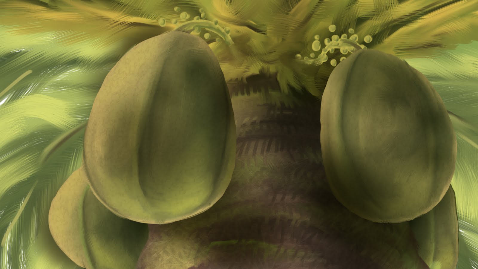
For this upshot of a coconut tree, I decided to start with the coconuts as they are the main focus of the shot. First I lay down the basic colors.
Then, using the mixer brush, I smoosh it all together.
Add a little reflected light from below.
Add the rest of the coconuts.
Block in the basic color of the tree itself.
Then add the other colors that make up the tree.
Smoosh it all together.
Add in some leafs in the background, some more detail in the tree, and the basic colors of the stems.
Smoosh the stem colors.
Here's where the thing really starts to come together in Photoshop. It's all about the textures one either finds online or takes with a camera.
Lay the desired texture over the coconuts (in this case an egg shell texture) and set the blend mode to a desired setting (in this case, overlay). Add a new layer with gradients (also set to overlay) above the coconut layer to add more shadow.
I overlayed a picture of fire over the leaves above and some organic textures for the trunk.
I put the fire texture over the background leaves. Then I added some blur to the leaves in the background and on the bottom of the trunk. Then I overlayed a paper texture while also adding a warming filter. That's it. Good enough for a quick shot.
Also be sure to make lots of layers for things. For my situation, I'm going to have the left coconut move slightly so I made it a separate layer. Separate layers also makes painting separate things and overlaying textures to specific objects easier.