
Sunday, September 18, 2011
My own Shorpy page
Yay! Now I've got my own little sliver of Shorpy.com for my photos: http://www.shorpy.com/TonyW


Thursday, September 15, 2011


Sunday, August 28, 2011
Frazetta
As has been stated many times before, Frank Frazetta is a GOD. The book of his rough sketches, appropriately titled Rough Work, is like liquid gold to me. Just like the old renaissance masters, the rough sketches of a pro are almost more interesting to me than the finished works. I like seeing the different approaches to figuring out an idea at its conception.
One sketch (out of many) caught my eye as a good example of solid drawing principles:


 In silhouette it's still easily readable as an Indian shooting an arrow, muscles flexing and everything.
I think it's also worth mentioning just how organic all of his stuff is. With the proliferation of anime there seems to be a tendency these days to straighten things out and sharpen corners on the human body (to streamline it):


One sketch (out of many) caught my eye as a good example of solid drawing principles:


Pure, solid drawing.

All lines lead to the head which leads down the arm, then to the arrow point, or the arrow can lead to the head. I think they're both important.

But the overall lines of action are clear.

I think it's also worth mentioning just how organic all of his stuff is. With the proliferation of anime there seems to be a tendency these days to straighten things out and sharpen corners on the human body (to streamline it):

Anime is a style, Frazetta is nature.

Monday, August 1, 2011
Jim
Here are some drummer boy sketches to help me get an idea for a character I'll call Jim, after Treasure Island.


Thursday, July 28, 2011

Monday, July 25, 2011

Monday, July 18, 2011
Coconut Short Update

Speaking of headache, looks like Sen here is in the process of getting a headache as well (or a very serious concussion).
So I'm nearing the end of line work now. One thing I'd do differently next time is, and I've only realized I skipped a step now after some agony, that I'd do the rough animation, then do a cleaned up version, then do the line-work. It's frustrating making up some things on the spot with the final lines over the particularly rough drawings. Things like hair and body mass become inconsistent.
And another thing; I seem to be more accurate when Sen is exaggerated than when he's perfectly on model. It still feels like night and day drawing on the Bamboo tablet compared to drawing on a piece of paper though.
Wednesday, July 6, 2011
Still

Tuesday, June 14, 2011
Background Process
I'm making a new short for my portfolio starring the same Samoan character as my last one, Sen Popo. Here's my process in making the background for a shot (which is all done in Photoshop CS5):

 Then, using the mixer brush, I smoosh it all together.
 Add a little reflected light from below.
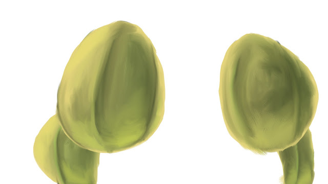 Add the rest of the coconuts.
 Block in the basic color of the tree itself.
 Then add the other colors that make up the tree.
 Smoosh it all together.
 Add in some leafs in the background, some more detail in the tree, and the basic colors of the stems.
 Smoosh the stem colors.
 Here's where the thing really starts to come together in Photoshop. It's all about the textures one either finds online or takes with a camera.
Lay the desired texture over the coconuts (in this case an egg shell texture) and set the blend mode to a desired setting (in this case, overlay). Add a new layer with gradients (also set to overlay) above the coconut layer to add more shadow.
 I overlayed a picture of fire over the leaves above and some organic textures for the trunk.
 I put the fire texture over the background leaves. Then I added some blur to the leaves in the background and on the bottom of the trunk. Then I overlayed a paper texture while also adding a warming filter. That's it. Good enough for a quick shot.
Also be sure to make lots of layers for things. For my situation, I'm going to have the left coconut move slightly so I made it a separate layer. Separate layers also makes painting separate things and overlaying textures to specific objects easier.

For this upshot of a coconut tree, I decided to start with the coconuts as they are the main focus of the shot. First I lay down the basic colors.


Lay the desired texture over the coconuts (in this case an egg shell texture) and set the blend mode to a desired setting (in this case, overlay). Add a new layer with gradients (also set to overlay) above the coconut layer to add more shadow.
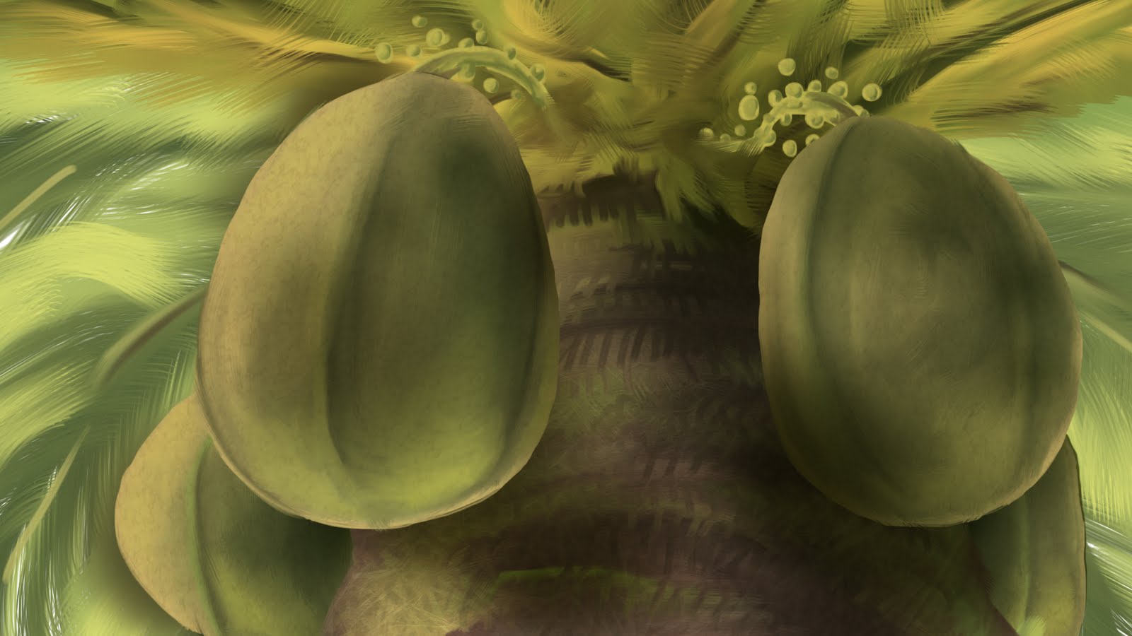

Also be sure to make lots of layers for things. For my situation, I'm going to have the left coconut move slightly so I made it a separate layer. Separate layers also makes painting separate things and overlaying textures to specific objects easier.
Wednesday, June 8, 2011
Bad Staging, Bad Composition

How am I supposed to be in awe or say how cool it is when I can't even tell what it is? This is pathetic marketing.
Saturday, May 28, 2011
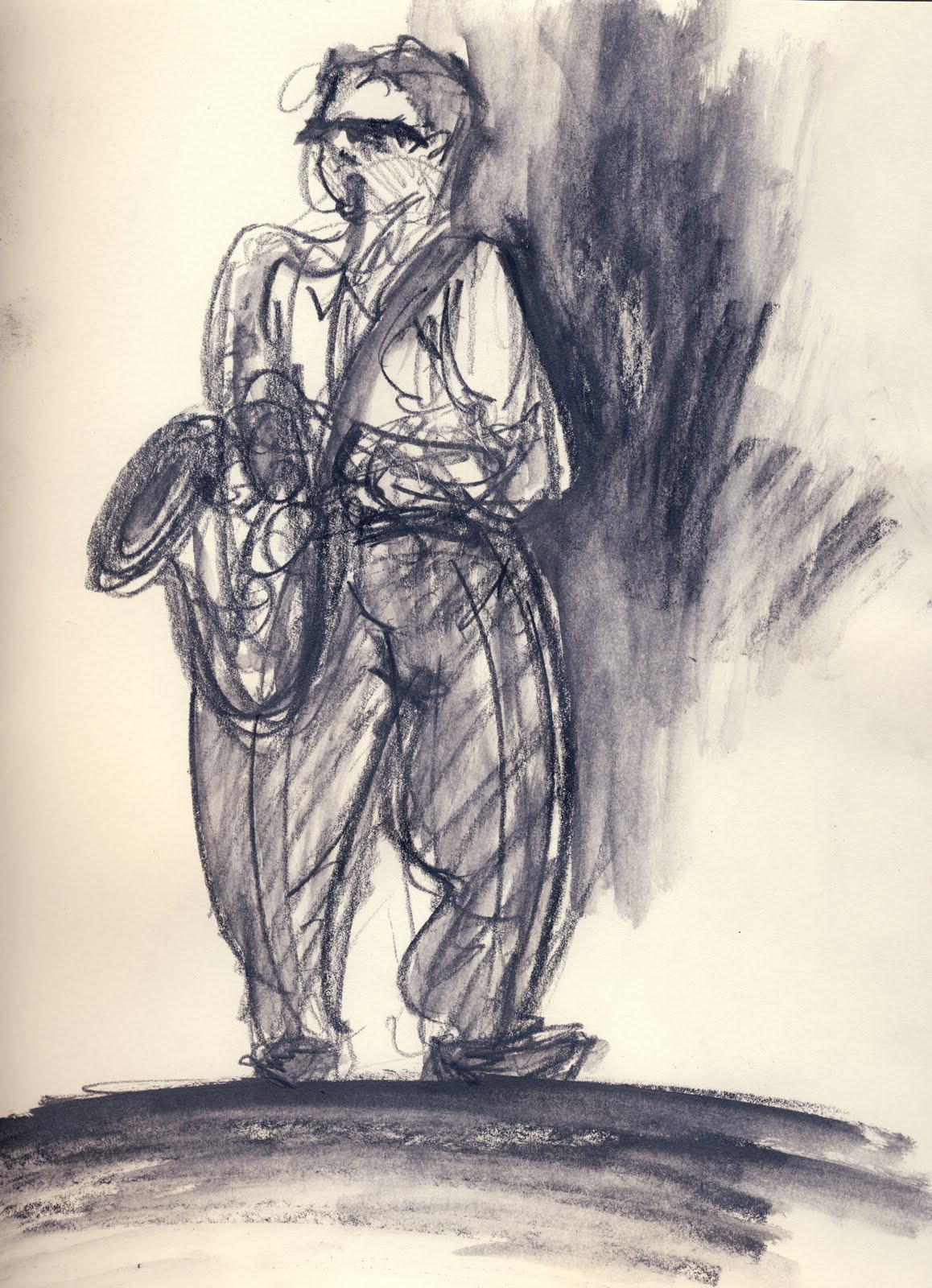
Graduation Band

It was the last day of class this semester and I brought my sketchbook along to see if I could find anything to sketch after class. I heard some music that sounded like it was a live band and went to check it out. Little did I know that a graduation ceremony was taking place later in the day and the band was warming up.

After a few sketches the musicians were cool with me and let me get really close to them and behind them on the stage.



Sunday, May 22, 2011
Monday, May 16, 2011
Tom Jones
I'm not sure how I feel about this scene: gross, sexy, funny, intriguing; I couldn't look away. At some point I thought, "Somebody stop these people!"
There's a beauty to it in that it's all visual storytelling:
There's a beauty to it in that it's all visual storytelling:
Saturday, May 7, 2011
Subscribe to:
Posts (Atom)