Tuesday, June 14, 2011

Background Process

I'm making a new short for my portfolio starring the same Samoan character as my last one, Sen Popo. Here's my process in making the background for a shot (which is all done in Photoshop CS5):

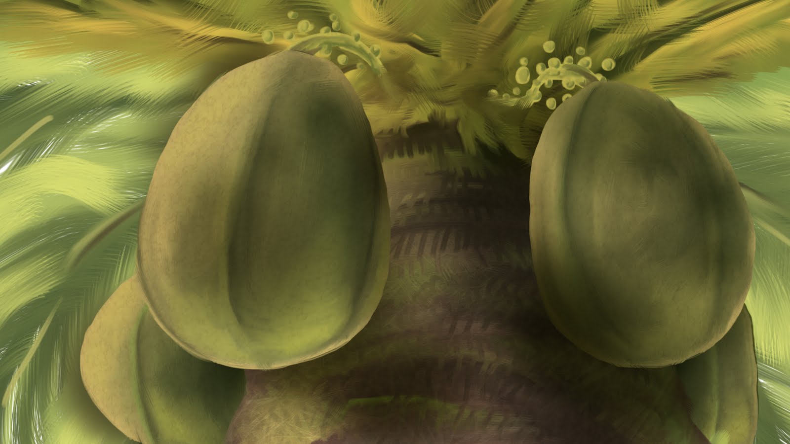
For this upshot of a coconut tree, I decided to start with the coconuts as they are the main focus of the shot. First I lay down the basic colors. 

Then, using the mixer brush, I smoosh it all together.

Add a little reflected light from below.

Add the rest of the coconuts.

Block in the basic color of the tree itself.

Then add the other colors that make up the tree.

Smoosh it all together.

Add in some leafs in the background, some more detail in the tree, and the basic colors of the stems.

Smoosh the stem colors.

Here's where the thing really starts to come together in Photoshop. It's all about the textures one either finds online or takes with a camera.
Lay the desired texture over the coconuts (in this case an egg shell texture) and set the blend mode to a desired setting (in this case, overlay). Add a new layer with gradients (also set to overlay) above the coconut layer to add more shadow.

I overlayed a picture of fire over the leaves above and some organic textures for the trunk.

I put the fire texture over the background leaves. Then I added some blur to the leaves in the background and on the bottom of the trunk. Then I overlayed a paper texture while also adding a warming filter. That's it. Good enough for a quick shot.

Also be sure to make lots of layers for things. For my situation, I'm going to have the left coconut move slightly so I made it a separate layer. Separate layers also makes painting separate things and overlaying textures to specific objects easier.

Wednesday, June 8, 2011

Bad Staging, Bad Composition

This publicity still for Transformers: Dark of the Moon is terrible because it has bad staging. The complexity of the character makes it hard enough to see it but put an equally complex mass of gyrating, transforming crap behind it and that makes for an indistinguishable mess that is hard to read. There is no clear silhouette, no clear line of action, no pleasing arrangement of shapes. It's all just computer graphics puked out onto the screen in a haphazard fashion with no design sense.

How am I supposed to be in awe or say how cool it is when I can't even tell what it is? This is pathetic marketing.

Saturday, May 28, 2011

Graduation Band


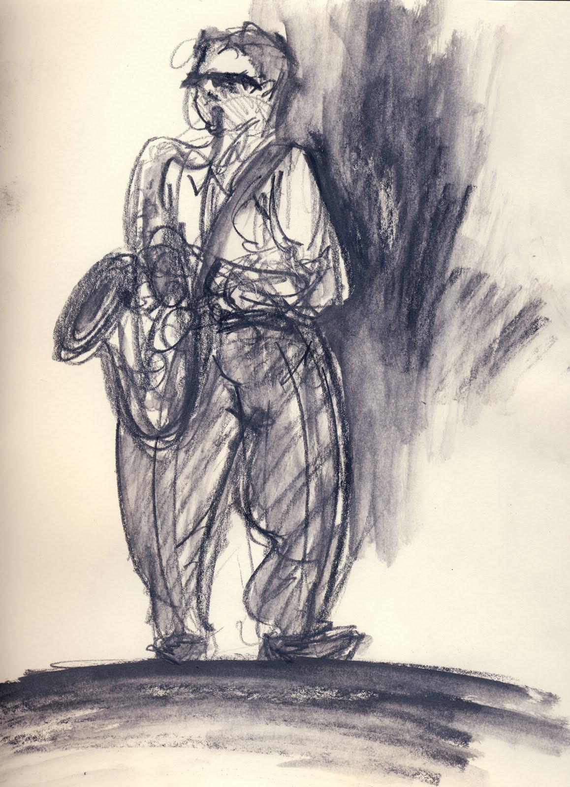
 It was the last day of class this semester and I brought my sketchbook along to see if I could find anything to sketch after class. I heard some music that sounded like it was a live band and went to check it out. Little did I know that a graduation ceremony was taking place later in the day and the band was warming up.


After a few sketches the musicians were cool with me and let me get really close to them and behind them on the stage.


Monday, May 16, 2011

Tom Jones

I'm not sure how I feel about this scene: gross, sexy, funny, intriguing; I couldn't look away. At some point I thought, "Somebody stop these people!"
There's a beauty to it in that it's all visual storytelling:

Monday, April 25, 2011

The Future Boy Conan


So, I just finished watching Hayao Miyazaki's 1978 TV series The Future Boy Conan and I'm absolutely stunned by the quality exhibited in this show both in its narrative qualities and in the background artwork and animation. 

 The story starts after world war III devastates the planet, sinking the continents and killing billions of people "in an instant", as the opening describes.


A boy named Conan grows up on an island with his grandfather 20 years after the war. For him life was peaceful but his grandfather worries that they may be the last humans left on Earth...


...until a young girl named Lana washes up on the beach.


And then adventure ensues.


I won't get into plot specifics, but I'll post pictures from the series that exemplify what is so great about it.

Friday, April 22, 2011

Photoshop sketch

I'm still not entirely pleased with drawing in Photoshop on a tablet. I have a hunch that drawing on a tablet with a screen on it would be easier to get what I have in mind on the computer.

Wednesday, March 23, 2011

The Heckling Hare


This is one of my favorite frames from any cartoon. "I... I crushed him..."


Sunday, March 20, 2011

Flash project

I've been working on a project for my Flash class the past couple weeks. Here are some screen shots:

Sunday, March 13, 2011

Tests

I'm working on a project for Flash class where my Samoan character, Sen, runs to a rock and jumps into a pond where he's eaten alive by a giant black octopus. I'm maybe half-way done. I've been producing some of my first run cycles and it's been a struggle, but not unbearably so (with a little help from my friend).
Here are some of the pencil, line, and finished color runs I've done (be sure to click the links that lead to a full-screen version to see more detail):


This was always intended to be a silhouette. Click


Pencil test. Click


Line test. Click


Final color. This is a hard angle to animate something running. Sen gets cut off at the end because that's where the bottom of the frame will be. Click

Monday, March 7, 2011

Transformation Fascination


I've always been fascinated with transformations of the bodily kind. Not slow progressions of change but the rapid, violently awful kind. Ever since I was a kid I've found it mesmerizing. I think it has to do with the things I used to watch growing up in the '90s.
One of my first fixations was the show Street Sharks. The concept of being physically transformed into a powerful shark creature that tore through the streets was so cool to me. But my favorite image from the show is the one above with the needles pointing towards the guys. Experimentation, transformation, chemicals, I ate it all up.